Sunday, June 28, 2009

circa survive.


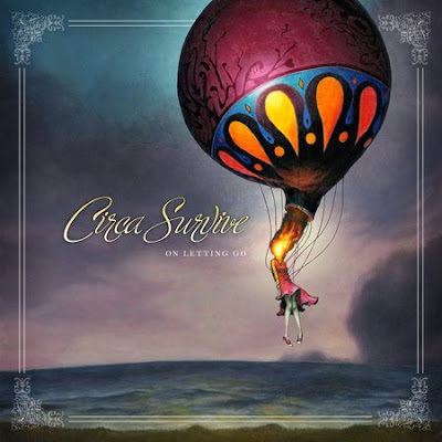
two album covers from the band, Circa Survive.

i am in love with these designs. both are beautifully detailed and hint toward the story within the album. i enjoy the smooth brush strokes, that make it seem as if every object runs seamlessly into the next, creating one united piece.

addicted romantic.


faker's album cover, addicted romantic. 

striking photo. easily identifiable text. borderless. what i love most is the representation of an addicted romantic as a bloody, cut up and bruised individual. 

so impossible.


just another quick sketch...something i thought represented the dashboard lyrics. i don't like the placement of the text, and i'm not sure where else i could go with the design...

instrumental.


beginnings of a potentially cool design. if only i knew where to take it...

a prescription for mankind.


the album cover for spinnerette.

i think i love this cover simply because it's so sexy, so daring. the blue overtones work really well, especially against the block yellow writing. 

personalities.


a quick sketch using the rorshach inkblots to connect with the ep title personalities.

Wednesday, June 24, 2009

the black ghosts.


the black ghost's self-titled album cover.

this is exactly the kind of design i want to create. i love love love the cover because it is seemingly so simple, and so immediately eye catching. it is such a clever design. 

bang!


i really like the concept of this design, but the whole thing - the girl, the heading and text - all need extensive refinement.

trial kennedy.


this poster was created to put to use the ikarii stencil i developed. i'm extremely happy with the black and white stencil of both the text and the plane. i also think the rich, textured background works well, however, i'm unhappy with the black, fragmented shapes at the bottom of the poster - they need further refinement. 
 

friday the thirteenth.


this was just a quick poster i put together using adobe photoshop and illustrator, for a friday the thirteenth party. the image of tim curry is the obviously main component, and i am really happy with its placement within the design - it helps the eye run from left to right. i also think the text works really well - the use of red for 'the' provides a strong contrast, and its placement suggests tim curry is almost speaking the words. 

young love.


i used an old family photo for this design, to emphasise the inclusion of the band, the young lovers. i used adobe photoshop to slightly distort the photograph, and make it appear more like a polaroid. the background is a collage of old family photos, to further highlight the 'young love' theme. i'm not entirely sure of the choice of typeface, but i do like the contrast between the block letters of the main heading, and the scrawl of the details.

comic book me.


i am so happy with this design. i feel the shading on the tee and arms is sufficient, but doesn't draw away from the text too much. i think the choice of typeface is appropriate, it further suggests the idea of a comic book sketch. i also think the black background, and black border are particularly effective. 

tessellations.


with the new ikarii ep possibly called personalities i thought a design centered around the use of tessellations could work really well. i'm happy with the overall concept, but i feel this design has a long way to go before completion.

valentine's day.


i was really happy with this design mostly becomes i completed it - start to finish - in about half an hour. it was composed entirely on computer, using adobe illustrator, and i wanted to create a kind of darker, punk alternative to the traditional vday messages.

i always struggle with backgrounds but in this case i think the white works well. i was also happy with the placement of text, especially including 'the peninsula lounge' within the broken heart. i also think the choice of typeface fits. i am unsure of the border however; i placed an uneven black border around the entire design, but i'm not entirely sure it's necessary. 
the dresden dolls.


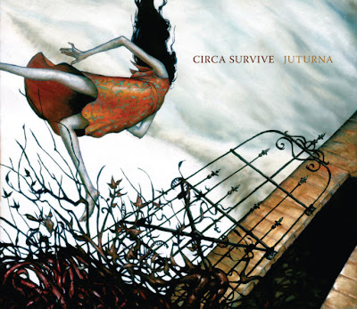
to be honest i'm not entirely sure why i love this cover so much, but it grabbed my attention immediately. i love that it is black and white, and that it includes so many different components in the one design. i think perhaps most special is that each time you look at the cover, something new catches the eye.

big day out.


i designed this piece for a competition advertised in beat magazine. the brief was to create a poster for the big day out '09, and the design was to be centered around a visual embodiment of one of the bands performing. 

i'm really happy with the black and white sketch, the main component of the design. i also like that the text is intertwined. however, i wasn't sure what to do with the background and i'm not sure this really fits. i'm also not convinced by the typeface i chose to use.


collidescope


the album art for stealing o'neal's collidescope

this cover plays to all of my favourite things. the background is simple, it doesn't draw attention from the central design but its colour and texture compliment the black and white stencil. the solid stencil also provides an excellent contrast to the coloured explosion. it illustrates the album title entirely. the only thing i'm not sure of is the typeface, it looks as if the designer just gave up when it came to including text.


i am all about the aesthetic.

i love good looking things. i love creating them, and i love seeking them out. aesthetically appealing things are what this blog is all about.