Wednesday, July 22, 2009

as lovers go_take 2.


this is a sketch i put up a while ago, but i tweaked it a little using adobe illustrator. i've cleaned up the sketch itself, making it a little...softer. i also created the text on the computer, replacing my own hand drawn efforts. i don't really want to colour in the design, but i would mind perhaps adding a background....

Monday, July 20, 2009

clouds.


a sketch i developed beginning with the idea of clouds. i used the band's existing typeface for ikarii. as usual, i began with just black fineliner and marker,  but to add more colour i tried using watercolour pencils. the final product looks significantly different on screen, the colours altered by the lighting when i took a photo of the design...but i think i like it...but i think i could like a greater contrast between the colours of the clouds, and the background.

...is it just me or is the text crooked? 

Saturday, July 18, 2009

lungs.


florence and the machine's debut album, lungs.

i'm not really sure why i love this photo so much . . . i think mainly it's because of the lungs necklace. i recommend checking out their myspace page, the artwork there is great.

Friday, July 17, 2009

tattoo.


again sticking to my black and white style, i used black fineliners and markers to create a traditional tattoo-type design. the heart and dagger is an old image idea, but i love it!

Tuesday, July 14, 2009

i am a twenty somethin'.


a weird, completely random sketch, centred around the idea of personality, and identity. again, entirely black and white, but i could see it working in bright colours, like a comic book or pop art piece.

stencils.


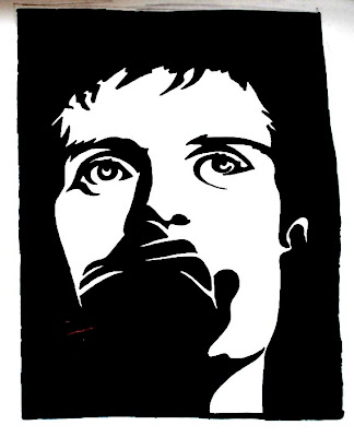
again i chose two black and white, high contrast photographs, to design two stencils. the first stencil, of joaquin phoenix, worked so well because of the division of the photograph into half white, and half black. the second - of ian curtis - was much simpler, the main focus being his eyes.

marsh & ian.


these are two sketches i did, from two black and white photos. the first is one of a friend, the lead singer in the band ikarii, and the second is ian curtis from the joy division. i chose the two photographs purposefully, as they were both high contrast images, and so lent themselves easily to the type of sketches i wanted to create. i used only black fineliners and markers, creating the darker areas with a crosshatch-type pattern. i think the use of a black background works extremely well, especially helping the image to fade into its surroundings.