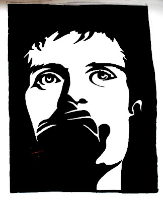

again i chose two black and white, high contrast photographs, to design two stencils. the first stencil, of joaquin phoenix, worked so well because of the division of the photograph into half white, and half black. the second - of ian curtis - was much simpler, the main focus being his eyes.

No comments:
Post a Comment