Wednesday, July 29, 2009

gen Y to do list.


i'm trying something different...the idea for this poster stemmed from an article in jmag magazine, commenting on the state of gen Y...in between applying for youth allowance, avoiding swine flu, and budgeting in alcohol for saturday night, we're looking for meaning, and purpose. we now have a mountain of opportunities that were denied our predecessors, but with all this choice we've lost our way. we want freedom, but we need direction. and on top of all that, any independence we've gained has been offset by a complete loss of trust by Gen X's, and belief in ourselves. the simplicity of the design hopefully allows its message to come through.


Monday, July 27, 2009

split personalities.


the beginning of a design, i hope. the three faces is taken from a photograph of a mask, to pursue the idea of 'split personalities'. again, i directed toward a design for the band, ikarii, which helps in providing me with guidelines, a type of brief i guess. again the colour is off because of the lighting when i took the photograph, but i think it could be a possibility for the design. this original sketch is simply with greylead, but i'd like to try it with black fineliner (surprise, surprise). 

...on second thoughts, i don't really like the colour.

Thursday, July 23, 2009

the con.


the lyrics for tegan & sara's album, the con. my sketch was initially just their two heads - drawn from a photograph of them - and then i thought to extend the black area and include the text. this could possibly be one way to display lyrics for an album...

Wednesday, July 22, 2009

where does the good go.


another quick sketch - sticking to black and white, comic book style - inspired by the tegan & sara quote.

so impossible_take 2.


this is another older sketch that i wanted to take another look at, to make it appear more as a finished piece. again i adjusted the image slightly. i also added to the dark puddle so that it extends to the edge of the design. i redid the text in illustrator, changing both its look and placement.

as lovers go_take 2.


this is a sketch i put up a while ago, but i tweaked it a little using adobe illustrator. i've cleaned up the sketch itself, making it a little...softer. i also created the text on the computer, replacing my own hand drawn efforts. i don't really want to colour in the design, but i would mind perhaps adding a background....

Monday, July 20, 2009

clouds.


a sketch i developed beginning with the idea of clouds. i used the band's existing typeface for ikarii. as usual, i began with just black fineliner and marker,  but to add more colour i tried using watercolour pencils. the final product looks significantly different on screen, the colours altered by the lighting when i took a photo of the design...but i think i like it...but i think i could like a greater contrast between the colours of the clouds, and the background.

...is it just me or is the text crooked? 

Saturday, July 18, 2009

lungs.


florence and the machine's debut album, lungs.

i'm not really sure why i love this photo so much . . . i think mainly it's because of the lungs necklace. i recommend checking out their myspace page, the artwork there is great.

Friday, July 17, 2009

tattoo.


again sticking to my black and white style, i used black fineliners and markers to create a traditional tattoo-type design. the heart and dagger is an old image idea, but i love it!

Tuesday, July 14, 2009

i am a twenty somethin'.


a weird, completely random sketch, centred around the idea of personality, and identity. again, entirely black and white, but i could see it working in bright colours, like a comic book or pop art piece.

stencils.


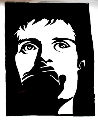
again i chose two black and white, high contrast photographs, to design two stencils. the first stencil, of joaquin phoenix, worked so well because of the division of the photograph into half white, and half black. the second - of ian curtis - was much simpler, the main focus being his eyes.

marsh & ian.


these are two sketches i did, from two black and white photos. the first is one of a friend, the lead singer in the band ikarii, and the second is ian curtis from the joy division. i chose the two photographs purposefully, as they were both high contrast images, and so lent themselves easily to the type of sketches i wanted to create. i used only black fineliners and markers, creating the darker areas with a crosshatch-type pattern. i think the use of a black background works extremely well, especially helping the image to fade into its surroundings. 

Monday, July 13, 2009

la roux.


la roux's self-titled album.

again, this is most likely 'cause i love la roux's hair. but it's true, the direction and shape of her fringe helps the viewer's eyes move from left to right, along the line of the writing. the design emanates a warm, red glow, emphasised by the background and, again, her hair. the lighting used has helped of highlight la roux's features, and the photograph has been given a kind of glow, so it almost doesn't look like a photo at all. the typeface is distinctive yet simple.

Friday, July 10, 2009

horehound.


the dead weather's new album, horehound.

it's just a sweet sweet photo. the girl is striking (and it doesn't hurt that it's alison mosshart, i love her!) and the black and white works oh so well. what i love is the perfect symmetry of the design. that's ocd for you.


Wednesday, July 8, 2009

nothing personal.


all time low's new album cover, nothing personal.

i think i like this design so much because it's something i'd like to - and think i could - create. the regal looking background contrasts well against the scribbles and scrawls of the centre piece, and the paint splatters only add to this image. i like the scrapbook-type feel behind the design, and i love the combination of both photographs and illustrations.

a chunk of change.


the chunk of change ep cover, by passion pit.

i think i'm attracted to bright colours. either black and white, or super bright colours! from this design i gauge a strong connection between the name of the band, passion pit, and the pit-like collection of geometric shapes. the typeface used also links into the clean lines and simple shapes. the colour of the background, as well as the colour of the shapes are slightly dulled, which helps break up the design a little; it creates greater texture. 

the reminder.


the cover of the reminder, by feist.

i love this design for its simplicity. the use of a silhouette is particularly effective. the background is plain, but add depth to the design, and the small use of colour helps create an aura around the centre piece of the piece, the woman.

secrets & lies.


black & white, original sketch.


this is a very bad copy - i don't own a scanner - but you get the general idea. i designed this poster for bertie blackman's upcoming tour, centred around the idea of secrets & lies, the title of blackman's latest album.

i began with the key and slowly added each design element. the background was the last thing to be included; i used watercolour pencils to try and create an ethereal looking background. i'm really happy with the end product, especially with the incorporation of a couple of different typefaces, and how the text really fits 'into' the design. the only thing i'd like to change is perhaps the colour, or the placement of 'secrets and lies', because i think it may get lost in with the other swirls. 

i like what i've come up with, but i always struggle knowing that you could take the design a million other ways; no design is truly finished, you could work and rework them forever. 


Tuesday, July 7, 2009

as day follows night.


sarah blasko's new album, as day follows night

i'm really into the whole kind-of-illustrative-watercolour-type designs at the moment, which is why i love this cover so much. the photo fits in so well with the small pocket of colour, especially because of the pencil-like outline of her hands. the text is simple and clear, it suits the rest of the design.

cage the elephant.


cage the elephant, their self-titled album cover.

oh i love this!! the skull is a favourite symbol of mine so this alternative take on it is great great great. it is also clearly the centre piece of the design; the background doesn't detract from it at all. i like that the design is illustrative, but still quite bold. the background in particular, its colour contrasts well against the dark writing and near colourless skull.

Saturday, July 4, 2009

a week in the life of.


a series of sketches around the idea of 'identity' and 'personality'. i have an idea on how to extend this further - i want to connect them all in one, larger design - but i'm not sure how it will work. i think i want to keep this black and white though, perhaps place them on a colour background?

as lovers go.


using another dashboard quote to inspire a new sketch. i'm not too good with drawing either hands or faces, which is what helped in deciding where to place the text, but i actually think it works kind of well. i'm experimenting with gaining a greater amount of detail in my sketches, still using just a fineliner. i could probably take the detailing in this further though. and the typeface needs ~major~ refinement!

Thursday, July 2, 2009

twenty-first invites.


a collection of designs i made for last year's birthday celebrations, entirely on my mac. the main aim of the designs was simply to convey necessary information.

stenciling.


using an existing photo, i wanted to try and apply one of my silhouettes, to see if i could create a stencil-type look...